My journey to accessibility

Sometimes it's difficult to understand when we got interested in a certain topic in the first place, most of the time it happens without us being completely aware of it. It's probably safe to say that my journey into web accessibility started a long time ago when I was a kid.
Thanks to my older brother I had the chance to mess things up in front of a computer since my early years, I'm talking about the Commodore computers age with its Vic 20, C64 and so on. Yep, I'm 'differently young'.
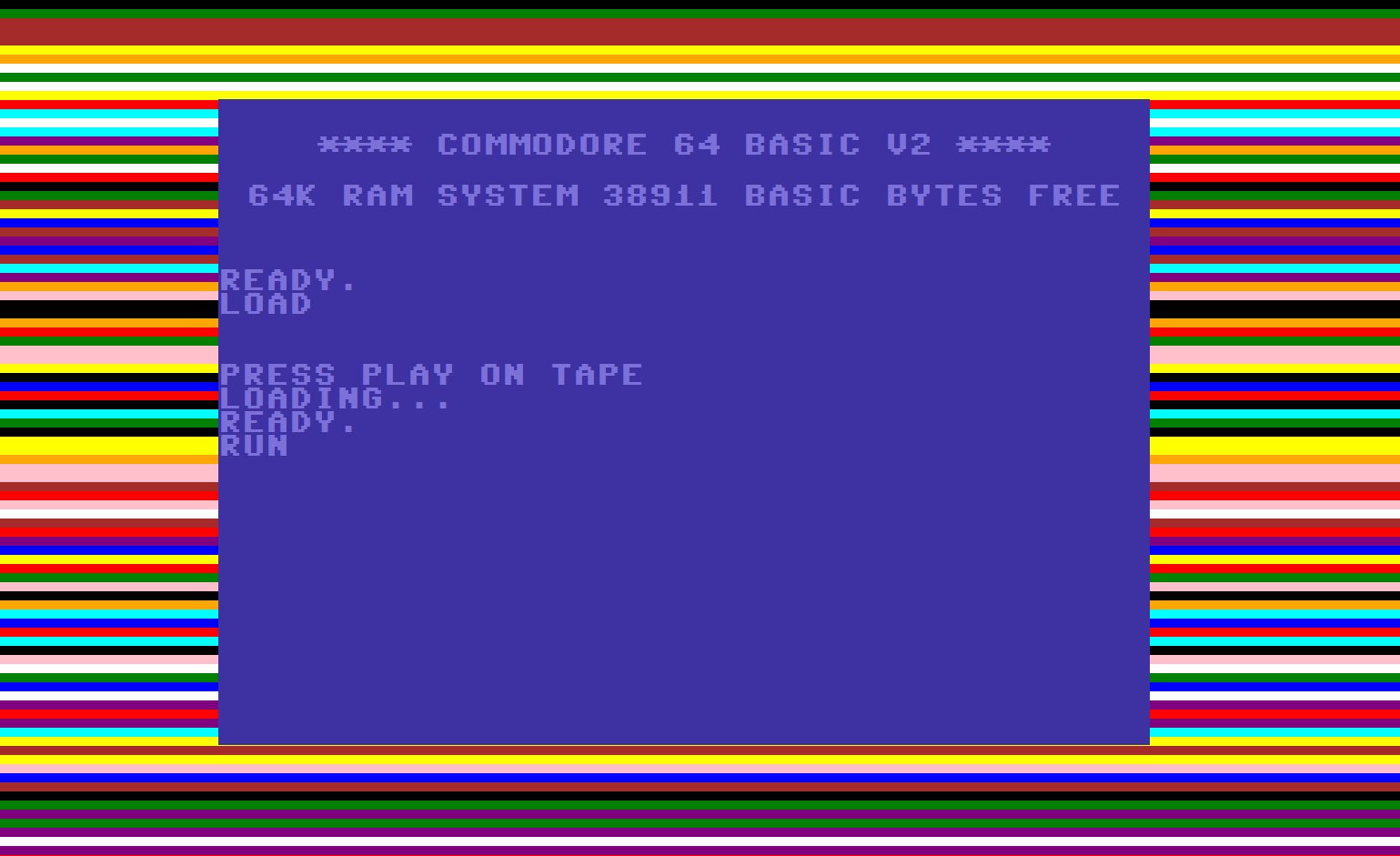
Back then, we had to wait for ages for a program or a game to load and who's old enough to live in those times cannot forget those crazy, colored moving 'loading' lines which appeared before being ready to start. We used to joke about the endless wait, staring at those annoying, almost hypnotic lines.

loading was stuck...
Photo from www.rcwebdev.co.uk
Epilepsy risks on video games?
It took some time for people and PTAs to start talking about epilepsy risks while playing video games. Could they really trigger a seizure? Oh yes. Nowadays I'm still playing an old video game from the early 90s titled Streets of Rage 3, they recently released the 4th on Steam. There was a level in a disco with lights going on and off repeatedly, simulating a dance floor: it still gives me headaches nowadays. I can imagine how people with neurocognitive impairments could cope with that. Luckily I've never witnessed a seizure in a long time. That would've terrified me in my younger years, but maybe it would have helped to develop some awareness earlier.
Visual effects like these were very common and there was no way to avoid them, no accessibility options whatsoever. Back in the day, there were complaints raised but not many changes from the companies and their products. It sounded like nonsense to me because I've never had any problems. Other kids, unfortunately, were not as lucky.
They were bad times for accessibility, not just on game consoles. Electronic devices like video recorders and hi-fi players had tons of cryptic buttons and functions which nobody understood, places and offices were rarely suited for people in a wheelchair. If you had an impairment - whether it was visual / motor / cognitive, you were severely limited because of poor environments and structures. Especially in Italy (where I’m from!).

Photo from www.arcadeattack.co.uk
The browsers war
Then the Internet came, with all its promising features: inclusivity and access to knowledge for all. Well, not really.
That's when I started to take these things a little more seriously, it was fascinating. I wondered how they made it possible and how those pages were built: they were made of simple links, lists, animated GIFs (sic) and some blurred images which took ages to load. So I started to learn a little HTML as a sort of hobby.
Knowing some basics, years later I started to study as a web designer, and that's when I came up with a classic book from the pioneer Jeffrey Zeldman, 'Designing with Web Standards', the year 2013. Ehm, 2003 to be fair. Wow, it opened my mind! Jeffrey went into detail about how to design pages the proper way - separating style and structure - and laying the basis for responsive design. He spoke about the (first) 'browsers war' during which the main competitors were trying to impose their standards. Hard times for web designers.
The main battle was between Explorer (a nightmare for all devs for many years to go) and Netscape Navigator, which years later decided to open-source the code and created the basis for the upcoming Firefox - These guys also created the infamous <blink> tag, bad accessibility at its finest.
Unfortunately, if your website didn't have anything moving, blinking or anything actually preventing you to engage with the content in some ways, you were nothing, not modern or innovative for the time.
Surprisingly, early assistive technologies were already trying their best to support people with impairments: JAWS screen reader was released in 1995 and still running today 27 years later. It took me a while before engaging and working with assistive technologies.
The book also managed to convey the struggle between designers, companies and the newborn W3C (World Wide Web Consortium) and how they managed to find the first standard guidelines and best practices, even if browsers kept implementing new features without worrying about compatibility issues. It was normal for a website to look different, depending on the browser, and be compatible with just one of them. Inclusivity...Where are thou?
At this stage, I was trying to get familiar with all the necessary tweaks to make things work on Explorer, Netscape, and Opera. Headaches were almost guaranteed at the end of the day.
First standards, then Flash
At last, Explorer 5 (for Mac) and Netscape 5(the year 2000) had a reasonable level of support for W3C recommendations.
That was amazing: websites started to be developed in a way that worked pretty much everywhere. It was a good step forward for accessibility too. Was it the start of a promising and fulfilling career? Well, not yet.
The Internet was still a brand new media and people were looking for interactivity: that was when Flash took over and many websites started showing moving lights - no...Again(?) - blinking buttons, animations that required time to load, and creative - often bizarre - interactions. No standards were followed anymore, no structure. A dream for many users but a nightmare for many others including me, let alone the ones in need of help. It looked like designers wanted to show off their skills without paying attention to the content. Nobody seemed to care about web accessibility anymore. My interest in the subject also faded a little bit.
The main point was to 'find a way to accessible rich media’ as the same Zeldman put it. HTML5, CSS3, and new JS libraries like jQuery came to help. With some other growing trends too...

Photo from www.smashingmagazine.com
Recent years
That brings us to more recent years: the ever-increasing UX and usability trends finally brought some light and people started to talk again about inclusivity, intuitive navigation, and interactions. So, finally back to accessibility. Every design-related blog recommended books like Steve Krug's "Don't make me think" which should be on every desk of anybody working in digital and technology. Simple and clever.
Working in digital gave me the chance to dig deeper into web design and accessibility. Huge steps ahead were made, even if sometimes it still looked like the main focus was for the website/app to look good on clients' browsers or mobiles.
And then we come to these times: I've had the chance to focus on accessibility, screen reading navigation, engage with real testing and understand more about the struggle faced by people with impairments. We're doing well even if there's always room for improvements: like involving people with real impairments on a regular basis and testing from the early phases. We're working on it!
If we look around us nowadays we can see a completely different awareness compared to some years ago. Every device has its accessibility options, they're tested continuously and are generally intuitive. If people don't understand a feature it's finally the designer to blame, not the other way around.
Meanwhile, accessibility checks and related tasks are popping up on project managers' screens more often than we know. Video games are as popular as ever but with no crazy moving lines or disturbing lights, unless we want them: it's getting more and more common to see dedicated accessibility menus to make the experience as enjoyable as possible for as many people as possible.
Next steps?
I feel like we - as people working in digital - aren't doing enough but at least it's not a matter of awareness anymore. The law is also backing us up, together with countless leading companies and communities.
An inclusive interface means it's very likely to be a simple, well-designed one - supporting all the people in need of help.

Photo by arstechnica.com
My mum has never put a DVD on to watch a movie or touched a computer: now she's 81 years old and pretty comfortable with her Android phone - and with WhatsApp too... - which is awesome. Even though she's not using her laptop as she did before. I think she might need some assistance, coupled with intuitive interfaces too. We must be there to help, that's all.
(If you haven’t read my previous blog about the start of Accessibility in gaming, go on, it’s really interesting!)
Take a look at our Accessibility evaluations and testing services too to see where we can help.


